BIG KEBAB
About Brand
BIG KEBAB is a kebab street shop based on Bekasi, Indonesia. BIG KEBAB offers various size and sauce of kebab. Besides kebab, they sell some different foods like beef burger and chicken wings.
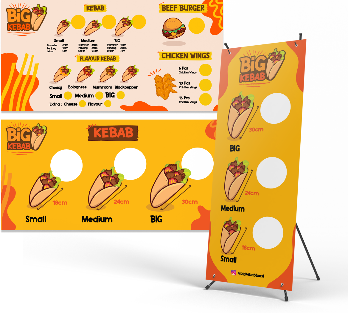
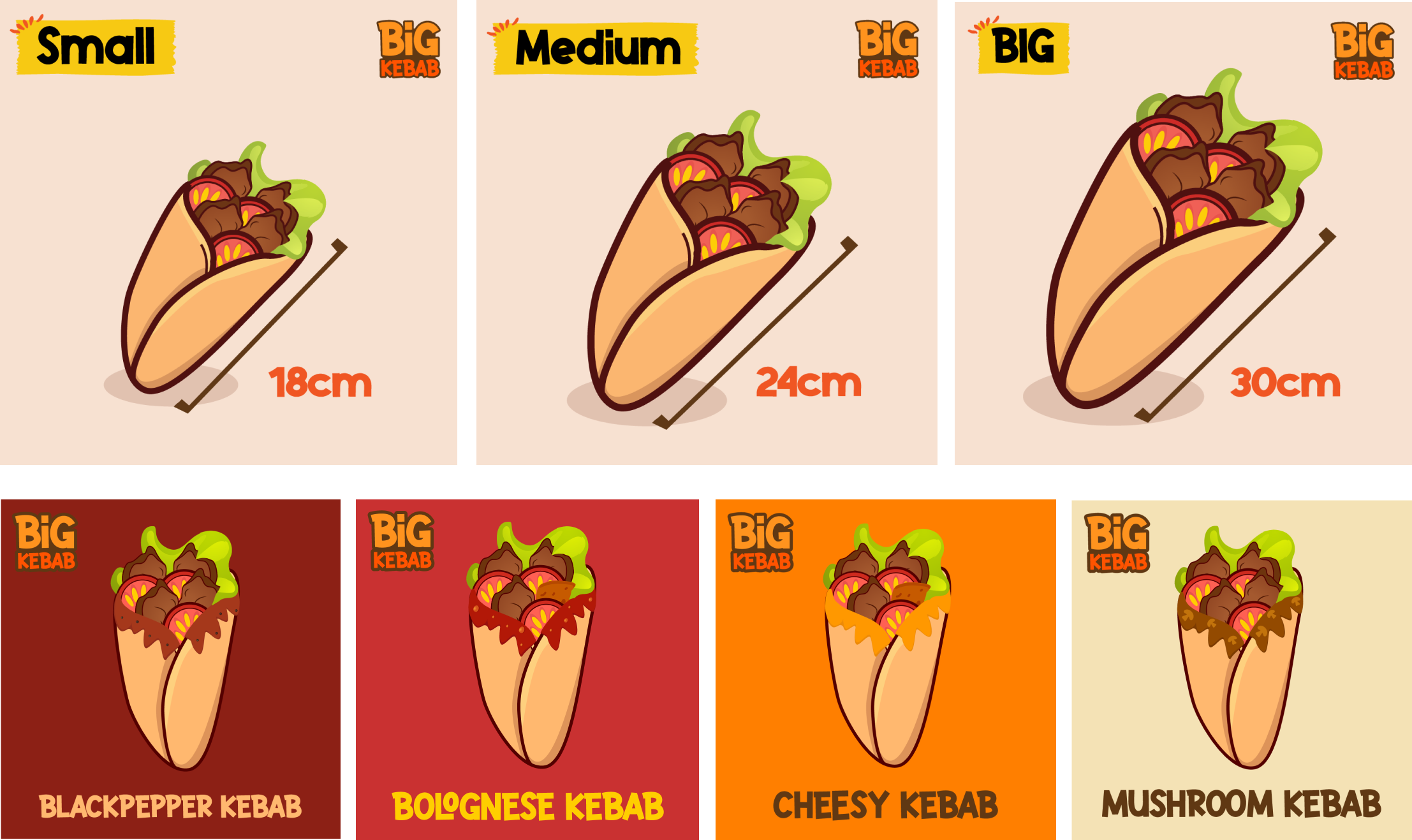
The UPS (Unique Selling Point) lies in their size of the tortila which range from 18-30cm long, 6-7cm width, and 27-44 diameter total.
Overview
The owners wants to build visual identity in form of logo, menu, and illustration of their business which it’s gonna be used for online food commerce, printed banner, printed menu.
Task and Goal
Create a cohesive brand identity for Big Kebab that reflects its commitment to high-quality ingredients, authentic flavors, and a unique dining experience. This includes designing a memorable logo, color palette, and typography that resonate with the Indonesian market.
This project aims to create a compelling logo and comprehensive visual identity system that will help BIG KEBAB stand out in the FnB industry especially in kebab while reflecting its business and culture.
Key objective: Make the simple wordmark logo that represent the product and UPS.
Design List
Visual identity, Marketing visuals
Challenge
In the vibrant and bustling street food landscape of Indonesia, kebabs are an iconic favorite. “Big Kebab” is a new and exciting brand aiming to make a bold entrance into this competitive market. The challenge is to create a compelling graphic design portfolio that captures the essence of Big Kebab and sets it apart from the myriad of other food vendors.
Logo process & concept
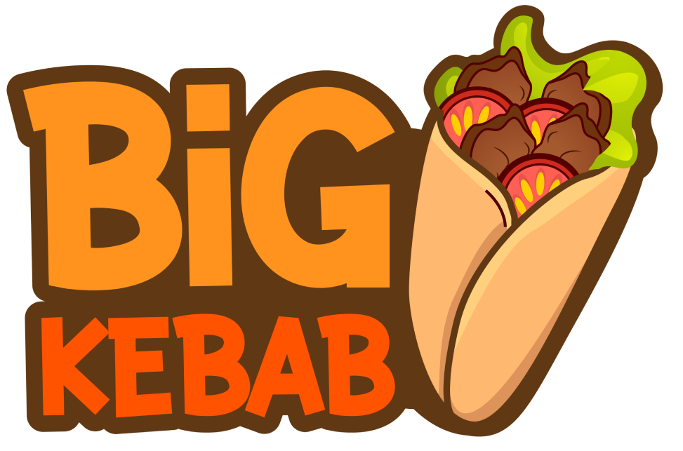
I do research about the kebab industry, market, and demography. Most of FnB business use wordmark logo to gain awareness and visibility for their customers.
I make a different approach than any local kebab dealer, I try to turn the UPS to the choosen type logo. When it comes to process, I make an expressive approach when thinking how i turn the UPS to logo. So, I make it 2 row words and aligned each other to make it loaded & highlight the “BIG” word.
For the visual is made by my observation from the kebabs streetshop market in Indonesia.
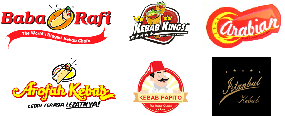
Brand color
Colors play an expressive role for BIG Kebab to make it bold and stand out from competitors also long lasting memory for their audience. These colors crafted based on markets and business attributes.
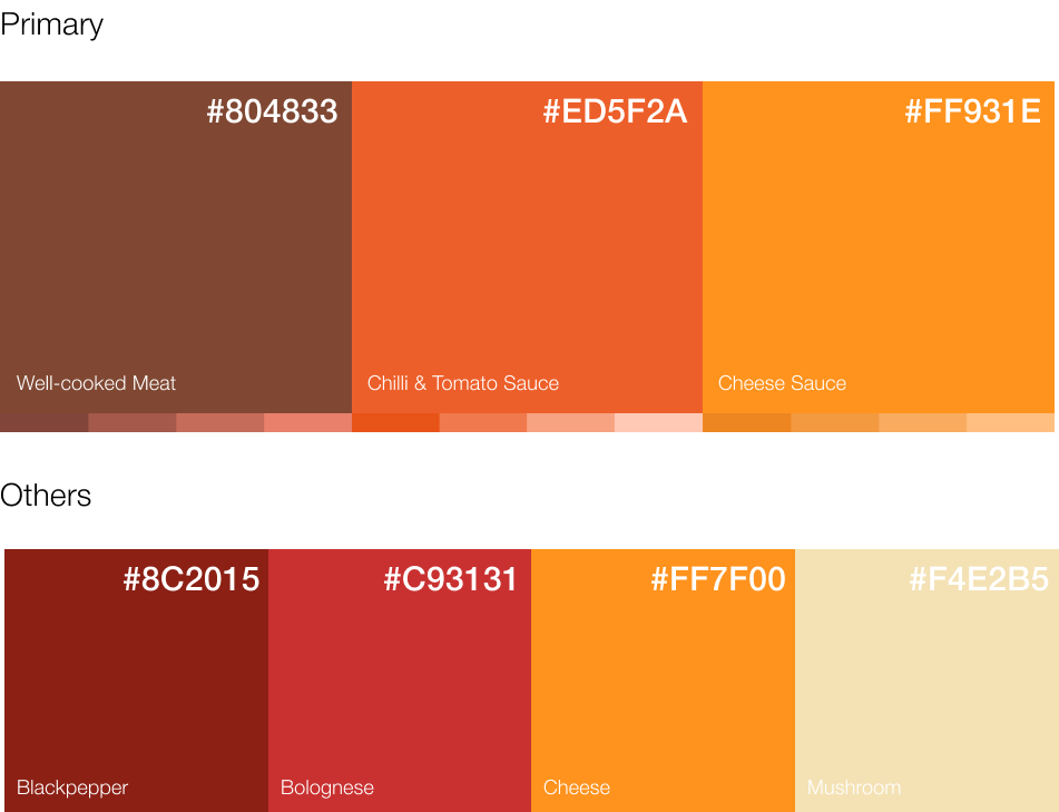
Brand typography
Mighty Rooster by InvasiStudio was selected as the primary font for the logo and any other media application. This font is a versatile vintage sans-serif font and has a bold and unique look to grab audience attention.


